The realm of typography is often overlooked, yet it holds profound significance in the organization and presentation of written content. One specific typographical format worth exploring is the hanging indent—a stylistic choice that goes beyond aesthetics to embody functional clarity. The hanging indent is particularly prevalent in bibliographies, reference lists, and certain styles of academic writing. By illuminating this nuanced format and examining its applications, one can understand the enigma of its appeal and rationale.
A hanging indent is characterized by the first line of a paragraph beginning flush with the left margin while subsequent lines of the same paragraph are indented. This format creates a visually distinct separation, allowing readers to grasp information quickly. The reason behind its widespread adoption in citation styles (such as APA and MLA) is evident: it improves readability and facilitates quick reference. Consequently, it enables scholars and students alike to engage efficiently with sources without losing their place in a text of potential complexity.
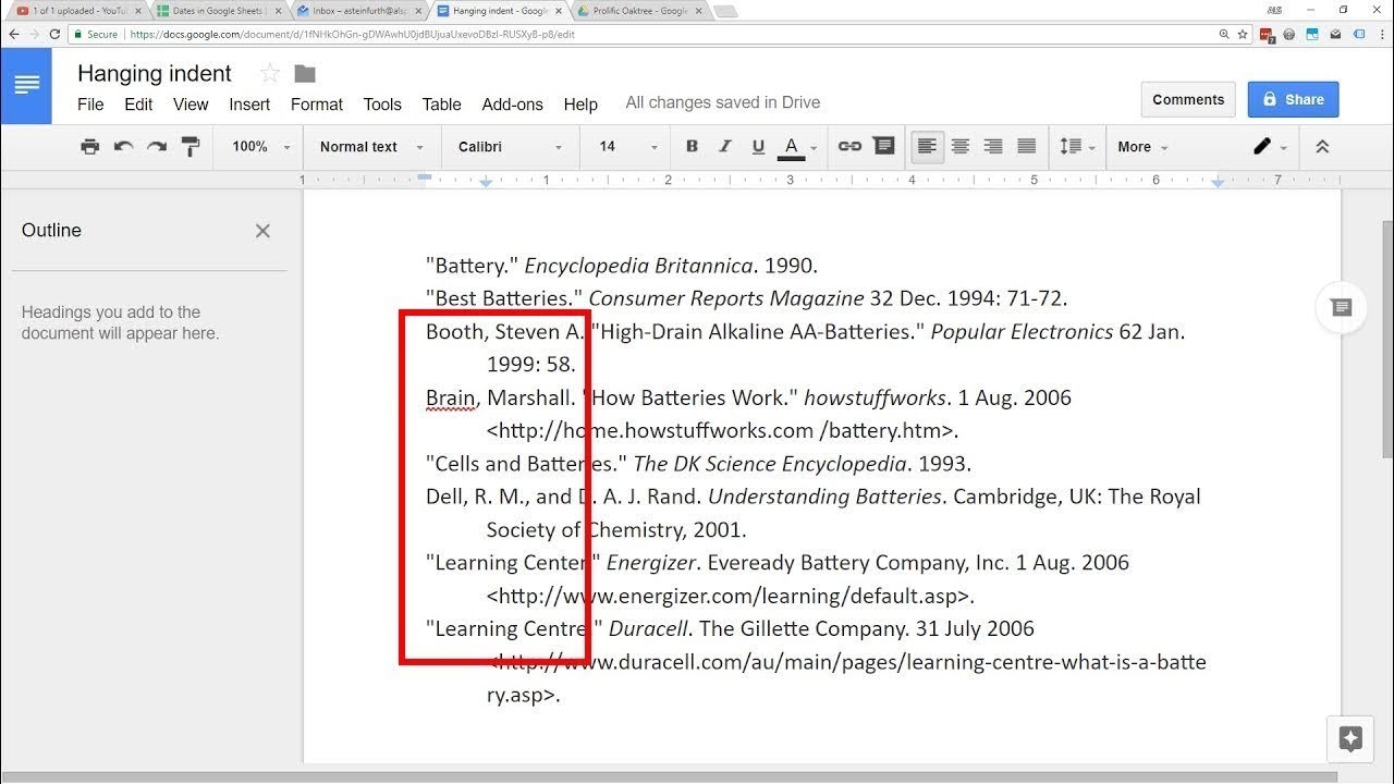
Consider, for instance, a typical reference entry in a bibliography:
Smith, J. A. (2020). Understanding the nuances of hanging indents. Journal of Typography, 34(2), 123-145.
   This study investigates the impact of indentation on reader comprehension, revealing significant insights into the cognitive processes at play.
With the initial reference clearly marked, subsequent commentary about the entry is easily discernible due to the indent. This format inherently dispels any clutter, allowing for a visually organized depiction of data. The human brain, inherently wired for patterns, thrives in environments where information is succinctly categorized. Thus, the hanging indent not only serves an organizational purpose but also caters to our innate inclination for order.
Beyond practicality, the hanging indent holds a certain aesthetic charm. In an age where digital information is omnipresent, the visual aspects of text presentation can influence user engagement and retention levels. This is where typography artists and graphic designers proliferate; they recognize that the visual presentation of text can evoke emotional responses. The hanging indent, with its precise arrangement of text, embodies a paradox of simplicity and sophistication—an interplay that captivates anyone who gazes upon it.
As one delves deeper into the significance of the hanging indent, it becomes evident that its usage extends beyond mere formatting conventions. In literature and creative writing, the choice to employ indentation can implicitly suggest a shift in tone or theme. It creates an expectation for the reader, signaling a change in rhythm. This subtle modification can endow the text with a multidimensional quality, inviting readers to explore meaning that transcends the surface-level narrative. Thus, when viewed through this lens, the hanging indent becomes not merely a formatting tool but a sophisticated mechanism for enhancing narrative flow.
The enigmatic appeal of the hanging indent also surfaces in its cultural resonance. Different societies engage with typography through various lenses. For example, in the West, where textual prowess is often synonymous with academic success, the hanging indent serves as a visual marker of intellectual rigor. Conversely, in other cultures, the stylistic element can evoke an affinity for tradition and structure, thereby creating a fascinating juxtaposition. This cultural dichotomy prompts deeper contemplation about how typography not only communicates information but also reflects societal values.
Additionally, the realms of digital communication and social media present an intriguing canvas for the hanging indent’s evolution. While the contemporary discourse often embraces brevity—limiting characters and promoting concise messaging—the hanging indent introduces a whimsical contrast. A well-organized hanging indent within a digital post, for instance, can transcend standard textual communication norms, capturing attention amidst the cacophony of overlapping dialogues. Businesses and individuals who effectively employ this format in presentations and digital content can mitigate information overload, positioning themselves as thought leaders amidst the chaos.
When examining the implications of the hanging indent across various disciplines, it emerges that the format can enhance user experience significantly. In academia, students are oftentimes inundated with a bombardment of information. The hanging indent alleviates this burden—the small act of indentation becomes a crucial ally in navigating complex ideas. Teaching students the intricacies of formatting, including the use of hanging indents, serves as an essential component in their academic journey, instilling a sense of diligence and attention to detail that extends beyond the classroom.
In the professional realm as well, the hanging indent assumes relevance. Its frequent appearance in resumes, reports, and professional correspondence demonstrates a commitment to clarity and precision—qualities that are unequivocally respected within any industry. By adopting this formatting choice, individuals sent a clear message: they value their audience’s time and understanding, thereby establishing a bond based on mutual respect and comprehension.
Ultimately, the hanging indent exemplifies the confluence of aesthetics and functionality in typography. Its unique format caters to our psychological inclination for organized layouts, while also enriching the aesthetic presentation of textual material. Through its application, a broader dialogue emerges—one that delves into the psychological and cultural dimensions of communication. Indeed, the hanging indent serves as a reminder that even the smallest elements of text can wield profound influence, guiding readers through narratives and information with grace and clarity.
In a world rife with distractions, the hanging indent stands resolute—a beacon of clarity in the tempest of information. Its importance, often understated, invites further examination into the depths of how we present and perceive written communication. Thus, as one navigates the multifaceted landscape of written discourse, the hanging indent remains a cornerstone of effective typographical technique, embodying a synthesis of simplicity and sophistication.